
Announcing new features.
Supporting the launch of Dark theme in Confluence.
2.66M users saw the Dark theme modal | 384k immediately enabled a theme (14.4%) exceeding our goal of 10%
The team: Product Manager, UX Designer, Content Designer (me); wider Engineering and Product team.
My role as content designer included:
The words on the modals.
Setting up an Instant Environment ahead of release, to capture screenshots, test functionality and create feature images.
Establishing consistent usage and capitalisation of theme names.
Conducting research into user behaviour on past feature releases.
Updating release notes and creating support documentation, including launching these in the CMS.
Working with the team on content strategy for the release.
Reviewing analytics, post-release.
Announcing … (drum roll) …
Confluence Data Centre released with three new features in version 9.0: Dark theme, word count and estimated read time. These features were eagerly awaited – Dark theme being the most requested change ever from Confluence users.
The challenge
How to remind users who upgraded to 9.0 that the features were available and supply them with links to useful information on how to enable/use the features.
Improve the read time and CTR on the modals to increase user engagement with the new features. Historically only a small percentage of users progressed beyond the first modal screen. Most dismissed new feature modals without reading them. These features were all heavily requested improvements to the user experience, so we wanted users to know that we’d listened and delivered.
Limited user attention span, and limited screen space for words.
Inconsistent internal usage of the feature name: Dark Mode vs. Dark mode, vs. dark theme, vs. Dark Theme, vs. Dark theme. More on this later…
The solution
Announce the new features via modals that appear after the user upgrades. While this isn’t new, the challenge was to improve user engagement to where users would cycle through all three screens before closing.
Use engaging, user-centric writing that explains the benefit to the user. Clear, concise and useful, but also fun – we wanted the users to feel excited.
Avoid having “Learn More” as links — these are non-specific and almost invisible to users nowadays.
Put the most requested feature first in the carousel, then second-most, then third-most, to ensure that at least the most important feature registers an impression even if the user immediately closes the modal.
The new features modal
1. Dark theme

Uses an exhuberant, excited heading to grab attention
Leads with user benefits
Reduces the friction to enabling the feature by explaining how easy it is to use
Follows Atlassian’s style, voice and tone guide, which includes the phrase “Playful, with a wink”; I did this by likening the change to turning out the lights. If you’re thinking of the phrase in relation to things people do in the bedroom, then that’s on you! ;)
Uses a more specific, descriptive link than the clichéd “Learn More” – the user can thus make a more informed decision whether to click the link.
2. Word count

We’re at the second screen – much like the second act of a play, where one needs some rising action to keep the audience awake – so I dialled up the linguistic gymnastics (lingnastics?) to keep the user moving through the copy.*
Users had been asking for this feature for, literally, years, so I wanted the language and focus of this screen to acknowledge community sentiment. “Rejoice” is the appropriate word here.
Once again, a more descriptive, specific link than a generic ‘Learn more…’
*The way language sounds is as important as what the words say. Our brains evolved before written language. English has its roots (and many root words) in oral storytelling cultures like that of the Anglo Saxons. There’s a reason why good writers read their written work aloud to test it. Alliteration, assonance, rhythm – used in the right place and amount – can engage a reader far more than flat sentences and flat formulaic language. Unless we’re building an app to tackle insomnia, we want to wake our users up not put them to sleep, make them feel something — because emotion drives action.
3. Estimated read time
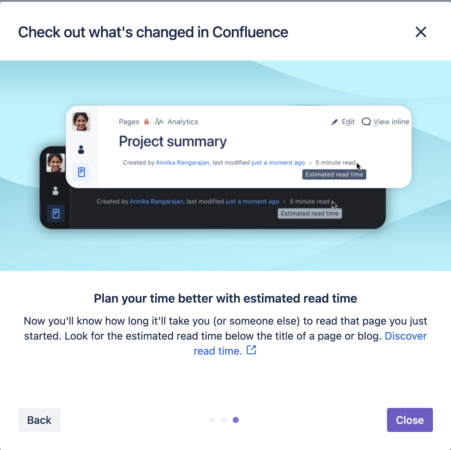
If the user has made it this far, I count it as a win. Leading with a clear statement articulating the benefit to the user.
The copy complements the image and reinforces where to find the feature.
A descriptive link that uses the emotionally charged word ‘Discover’ to entice the user to…well…discover the support doc that explains it. Because ‘discovering’ things in this context hints at surprise and reward, and sounds way more exciting than just ‘learning’ about them!
What’s in a name? Dark theme vs Dark mode vs Dark Theme vs dark theme.
Part of the challenge involved establishing rules for capitalisation and usage of the feature name to maintain consistency across all our in-product copy and public self-help documentation. Many were referring to it internally as ‘Dark mode’, perhaps because we mainly used Macs at the company and people had gotten used to the term from their laptops.
But Confluence already had the ability to create custom colour schemes, so we wanted to align with the existing language and name the preset colour schemes, ‘themes’. With 140+ content designers in the enterprise team, I reached out on the #content_design channel in Slack and put the question around capitalisation. The consensus was to capitalise the names of the various themes (Dark, Original and Light), and not capitalise the word ‘theme’. This allowed a writer to also refer to themes by their single-word proper-noun names. For example: “Which theme shall we use, Original, Dark or Light?” vs “Which theme shall we use, Original Theme, Dark Theme or Light Theme?”, and so on.
After the discussion, I wrote a short style guide in our project channel outlining usage and capitalisation, with examples. I was constantly following up and correcting people in channels and planning docs and Jira tickets, until usage was cemented in people’s minds. But we got there in the end!